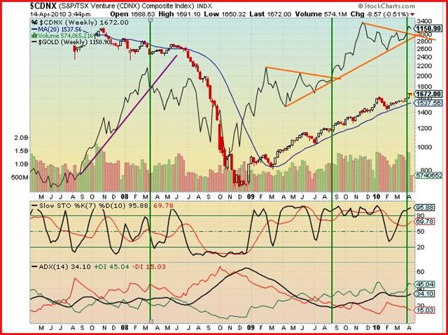
The move by the CDNX since late 2008 (from just below 700 to nearly 1700) has been truly quite remarkable in its strength and consistency. At some point there will be a substantial correction, likely in the order of 30% given historical patterns, but exactly when that will occur of course is impossible to say. Our best guess is that we’ll see the CDNX take a run at the 2000 level before a major correction sets in. That seems to be the most likely scenario – the next major resistance on the long-term charts is between 1950 and 2350.
The CDNX has proven to be an extremely reliable leading indicator of the direction in gold prices (and commodity prices in general) as well as the overall economy – the best example of this was when the Index broke down in July, 2008, prior to the collapse of everything else. When certain analysts a couple of months ago were saying gold’s bull market was over, we were buying because the CDNX was telling a different story.
CNBC Anchor Larry Kudlow wrote an excellent article the other day that the unexpected is about to happen – a V-shaped boom is coming. He could be right. “Commodity charts are roaring,” stated Kudlow. “All manner of raw materials have been booming – iron ore, steel, you name it. More V-shaped recovery. So with higher commodity prices running virtually across the board, there is every incentive for rapid inventory-rebuilding.”
The action in the CDNX supports Kudlow’s argument. “I have written extensively about the tax-and-regulatory threats of the Obamanomics big-government assault,” stated Kudlow. “But most of that is in the future. The current reality is that a strong rebound in corporate profits (the greatest and truest stimulus of all), ulta-easy money from the Fed, and some small stimuli from government spending are working to generate a stronger-than-expected recovery in a basically free-market economy that is a lot more resilient than capitalist critics think.”
So 2010 could turn out to be a pretty good year for investors in the junior resource market. Not of course just because of stronger growth in North America, but even more importantly because of China, India and other emerging markets where demand for raw materials and commodities continues unabated. The Chinese have been on a resource grab which is only going to intensify.
Expect the continued CDNX surge to be fueled as well by a growing number of takeovers – Underworld (UW, TSX-V) and Brett Resources (BBR, TSX-V) are just a couple of recent examples. The big fish are hungry, and they’re increasingly going after the little fish.
Let’s take a look now at a combined CDNX/GOLD Chart prepared by John, BMR’s contributing technical analyst, who has made some excellent calls:

CDNX/Gold chart – John says the outlook for both is very bullish.
John: Today’s weekly chart shows the correlation between GOLD (continuous contract) and the CDNX. The CDNX is shown in candle form and GOLD is a solid black line. The two indicators, “Slow Stochastics” and the “ADX”, refer to the CDNX.
Consider first the CDNX. Since the minor reversal/correction at the beginning of 2010, the Index has had a sustainable climb supported by its 20-day SMA (blue line).
The Slow Stochastics shows that the %K (black line) is high in the overbought area with the %D (red line) climbing toward it. However, this should not cause concern at this time as both lines can remain overbought for a considerable period as we saw between July, 2009, and January, 2010.
The trend indicator, ADX, shows that the CDNX has been in an uptrend since July ’09 (green line above red line) and recently the ADX (black line) turned up, indicating a strengthening of the uptrend.
The GOLD chart has a trendline (orange line) drawn under the lows from April ’09 to the present. This trendline is parallel to the supporting 20-day SMA of the CDNX. Thus, both are moving in tandem.
Since January, GOLD has had two consolidation periods as shown by the two orange triangles. The two vertical lines show the breakout points from these consolidations and the action on the CDNX at those times. Note that GOLD broke out of the right triangle at the end of March.
Compare the slope of the GOLD trendline (mauve line) on the left with that of the orange trendline. The mauve line has a much steeper gradient and was not sustainable. The orange line’s gradient is less and thus should be more sustainable and remain intact for a longer period of time.
Also note that before the CDNX reversal in January ’09 there was no correlation between GOLD and the CDNX.
The outlook for both GOLD and the CDNX appears to be very bullish. The time for concern is when and if either one breaks down through their respective trendlines.
