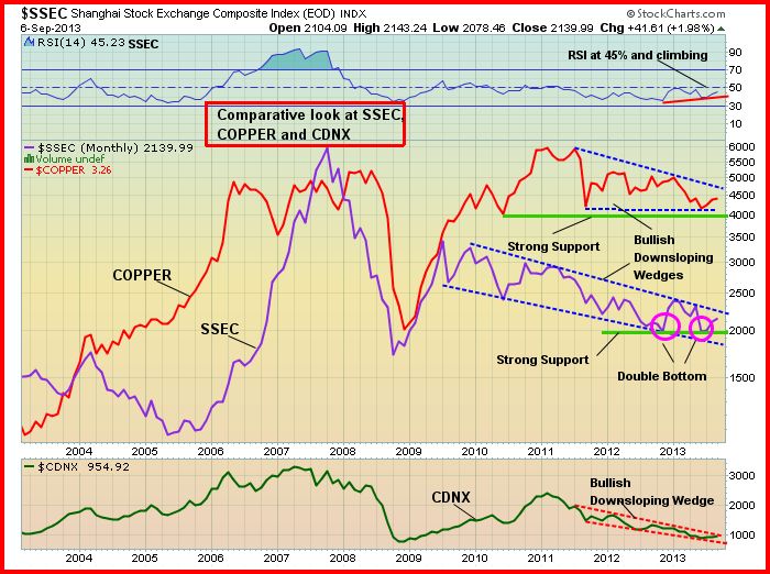
Below is a very revealing 10-year comparative chart from John that shows China’s Shanghai Composite, Copper and the Venture Exchange. As we’ve often illustrated at BMR, there is a high correlation between the Shanghai and the Venture (plus the S&P/TSX Composite).
There are a few important points regarding this particular chart:
1) At 955, the Venture is on the verge of breaking out above a downsloping wedge as you can see on the bottom of this chart;
2) The SSEC, in our view, put in a double bottom and notice how the RSI(14) hit an important low in late 2012 and is currently in a clearly established uptrend – this is very bullish for the Chinese market and that in turn bodes well for commodities. Again, there is a proven strong correlation between the Shanghai, the Venture, and the TSX Composite;
3) Copper has shown superb support and appears to want to move higher, which is significant for the Venture.
As part of Monday’s Morning Musings that we’ll be posting at approximately 5 am Pacific, John will be examining a very important long-term Venture chart that provides powerful evidence that the 2+ year CDNX bear market indeed appears to have ended.
SSEC, Copper & CDNX Comparative Chart


3 Comments
Jon,
Please look at azc Augusta resource …
Permits are close …
Thanks, Frank…
Jon,
I have owned this stock since 2005.
The environmentalists hate this company.
Based in Arizona, it will be a copper mine supplying 10% of US copper.