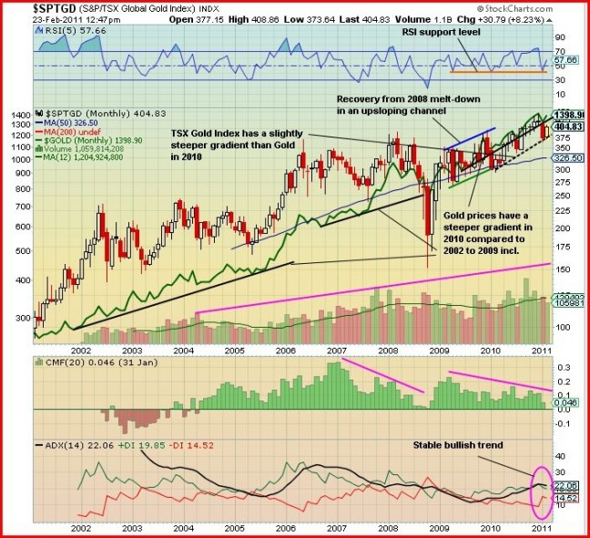
John: Today we analyze a 10-year monthly comparative chart of the TSX Gold Index ($SPTGD), the focus in candle format, and the Gold (continuous contract), a thick green line, to determine their present relationship and the historical relationship over a 10-year period.
Looking at the chart we see that from 2001 to 2008, until the Market Crash, the price of Gold consistently trailed the Gold Index. The drop in the Index in 2008 from a high of nearly 400 to 150 (a loss of 62.5%) was devastating to the investors of Gold producing mining stocks. Even though the Index recovered and more than doubled within 3 months, many investors were shy to step back into the market. The price of Gold was not hit so hard as it dropped from slightly above $1,000 to just below $700, a drop of 30%.
The chart shows that 2009 was the year for the start of the recovery for the Index as it moved within an upsloping channel (blue top sloping line and green bottom upsloping line) but during that year there was high volatility, a sign of trading and distribution. Gold moved up as well during the year at about the same gradient as the Index. For the Index, 2010 was different. There was less volatility and more stability and it climbed at a gradient slightly steeper (black dotted line) than that of Gold (black line). This was the year that true investors really started to accumulate shares of the producers. It appears the huge sell-off in 2008 really hurt the producers, thus it took time for the Index to completely recover. The volume has consistently increased from 2001 but in recent years some of this has been trading and distribution rather than accumulation.
February, 2011, has been a bullish month for the Index and with Gold maintaining a high price level we could see a good move to the upside over the next few months. At Friday’s close of 395, the Gold Index is at strong support. It appears an important bottom was made January 25 at 365 when the Index fell just slightly below its rising and supporting 300-day moving average (SMA), not shown on the chart.
Looking at the indicators (TSX Gold Index):
The RSI recently bounced up from the support level at 40% and has room to move before becoming overbought – bullish.
The Chaikin Money Flow (CMF) shows the buying pressure increased from being negative in 2003 to a high of 0.34 (rather bullish) in 2007, then it started to decline and reached nearly zero in October, 2008. The buying pressure increased to a high of 0.24 in March but has since declined and the average over 2010 was approximately 0.1. Look for buying pressure to increase again this year.
The ADX long-term indicator is in stable bullish orientation with the +DI (green line) at 20 and above -DI (red line) at 15, and the ADX trend strength indicator flat at 22. This is in a good position for a bullish move up for the +DI.
Outlook: I expect the TSX Gold Index Index and Gold itself will continue to move higher in concert for at least the first half of this year as the outlook for both is bullish.

